We cantors had this crazy idea – well, I had this crazy idea: a new machzor deserved new music. The process of creating a new machzor transformed the conversations about the narrative of the High Holy Days; that conversation should extend to the message and experience of its music as well. So two years ago, we convened a group of cantorial colleagues to study Mishkah HaNefesh, to delve into its new texts, layouts, and flow of prayer and song. This was truly an inspired combination of cantors with different backgrounds, experiences and talents; our study and dialogue was of great depth and excitement as we considered our current musical repertoire for the High Holy Days, where we wanted either a new musical expression of a familiar text or deliberating about what we would aspire to have for some brand new text.
The journey has been amazing. We approached a cohort of composers from the Reform Jewish world, our friends and colleagues who are members of either the American Conference of Cantors or the Guild of Temple Musicians, with a bold invitation – to donate their time and talent to us through the gift of a musical composition to be part of what we hoped would be a ground-breaking anthology of new High Holy Day music. Their generosity of spirit was overwhelming. Our committee then proceeded to commission each composer with a text and genre of musical direction, specifically chosen for each composer. And so, Shirei Mishkan HaNefesh was born, the newest music created by those who are called to express our deepest hopes and aspirations through music, the musical threads of Mishkan HaNefesh.
In the ensuing months, we spent time in dialogue with each composer as their creative juices flowed. Together, we tweaked and refined each draft of the composition, bringing the text to life through the musical notes and voices; this partnership helped to create the extraordinary musical expression that we envisioned and hoped for.
Fast forward to our recent ACC-GTM convention in Fort Lauderdale – the first copies of Shirei Mishkan HaNefesh arrived! In keeping with the goal of honoring the generous contributions of the composers, the volume also contains short statements from each composer about their musical inspiration for their composition. We chose to present the entirety of its contents to the convention participants in order for everyone to have a more concrete experience of the music, and enable all of us to determine the ways we would use pieces in our services.
Of course, that presentation required rehearsal and preparation. What an experience it was, to sing and hear the notes come off the page, springing to life as we began to sing. The resonance of the piano, the soaring voice of each cantor, the blending of choral voices, the rising and expansion of sound and word: we had seen it on paper, heard it in our heads, yet the layers of sound and the diversity of expression were so much more moving than I even anticipated. As the Editorial Chair of the project, I had the opportunity to write some introductory words to the volume. Experiencing the music coming to life, I feel even more confident in the hopes I expressed there, that these beautiful musical expressions of our sacred texts will inspire all those who hear them, helping them enter into the Mishkan of prayer in the Days of Awe, with a sense of fulfillment and peace.
—
Cantor Susan Caro serves Northern Virgina Hebrew Congregation in Reston, Virginia. She is also the Editorial Chair of Shirei Mishkan HaNefesh.
Shiru l’Adonai Shir Chadash–Sing unto Adonai a new song. As worship leaders and worshipers, how many times have we heard this charge from psalm 96? It is a wonderful reminder of the interplay between scripture and liturgy, and their fundamental difference. Scripture does not change. Indeed, even the would-be “mistakes” of the Torah are not corrected. Rather, alongside them in our chumashim we see how certain words really should be spelled and/or vocalized. Liturgy on the other hand has long been fluid–ever changing to match the new hopes, desires, frustrations, and morals of humankind’s maturation. Singing to God a new song is to constantly find new ways to express our evolving expression to God. As a result, change in liturgy and the music therein has been constant not only in our movement, but also in other Jewish movements and in other religions generally. As we pray together each week, we attempt to transform ourselves so that we can meet the moral and spiritual challenges each changing day brings.
One exception to this constant, gradual change is the liturgy and music of our High Holy Day worship. Like a massive ship, the services for the Days of Awe carry many more of our congregants, and meet far less frequently than our Shabbat services. While the liturgy and music of the High Holy Days we know today is quite different from that of even 50 years ago, they are still progressing at a much slower pace. Therefore, change to this grand liturgy is more jarring and difficult when it comes, even when that change is long overdue. But as the High Holy Day liturgy helps us make cheshbon nefesh–accounting for our souls–it is of utmost importance to keep these prayers and their musical expression up to date with humanity’s ever changing moral, spiritual and aesthetic requirements.
What could fill cantors and synagogue musicians with more purpose and joy than to literally follow the psalmist’s urge to sing a new song unto God? Shirei Mishkan Hanefesh, the musical companion to our new machzor, Mishkan Hanefesh, attempts to fulfill the monumental task of creating new melodies to express our liturgy during the yamim noraim. Indeed, the beauty of this new music is that it will make more of our liturgy accessible to our congregations. The goal of introducing these new settings, however, is not to replace the older ones, but to live alongside them so that they add to the richness of our prayer. While liturgy changes, scripture’s grounding constancy reminds us that we must walk a careful path between change and tradition. Carefully updated liturgy and music for our High Holy Days bring our penitential prayers fuller expression, but they cannot effectively do so without the same attentiveness to the established prayers and music that have carried us thus far.
Cantor Daniel Mutlu serves Congregation Beth Israel in Houston, Texas. Cantor Mutlu was also on the editorial committee for Shirei Mishkan HaNefesh.
A few weeks ago I had the chance to sit down and talk with Joel Shapiro, the artist behind the images in Mishkan HaNefesh. We met in his bright, airy studio in Long Island City to talk about his work.
Hara: Joel, can you tell me a little bit about why you were interested in being part of Mishkan HaNefesh? From the outset of the project you expressed excitement at the prospect of your involvement.
Joel: How could I say no? I loved the challenge of coming up with meaningful imagery to match such deep content. Visual art can be tricky – the goal is not simply to illustrate, but, in this case, to create images which correspond to profound and historically significant prayers and material. My role here is that of mediator – attempting to capture the meaning I see in the material, and translate it into form.
Hara: Could you talk about your process? How did you prepare yourself to craft a visual response to the content of Mishkan HaNefesh?
Joel: I tried to read the prayers carefully in order to understand the meaning and value of each word and image throughout the text. I wanted to connect the prayers’ implications to abstract form through woodcut — the medium we decided on together when you first approached me.
Hara: And why woodcuts? Why did you choose that format?
Joel: Woodcut is a very unusual process, one that involves creating a kind of visual typeface from scratch. I felt that I needed a kind of looseness to do this. So I began to draw on paper and then cut the paper out. Sometimes I wasn’t even drawing; I would just use the scissors and find a form that connected to the content or feeling of the prayer. Basically, I was cutting paper to find the form, a technique I have used in the past. (I don’t think I was influenced too much by the Matisse exhibition that was happening at the Museum of Modern Art at the same time, but you can’t cut paper and not talk about Matisse!) Then I would take the paper, scan it, and try to transfer the image to the wood block. In the beginning, I didn’t know exactly how I would transfer the paper image to the block, but ended up taking a low-tech Xerox of the image and then using acetone to transfer the image from the Xerox to the wood. From there, I would cut the form into the wood to be printed. Once I had an initial print, I would then reduce and eliminate any excess. The challenge here is to decide how much wood you want to remove – do you want the image to function independently of any kind of frame or background?
I’m really excited by how the woodcuts came out. Even though in some cases it feels antithetical to the feel of the metal type used in the rest of the book [to set the text throughout the book], the materials are comfortable together.
Hara: One of the things we, the editors, love about the use of wood as part of the materials, and part of the reason we were excited about your choice to create the art as wood block prints, is that wood has so much rich metaphoric weight in our Jewish traditions – Eitz Chayim, the Torah is the tree of life, the tree in the Garden of Eden, and so on.
Joel: I thought of that too. I was also moved by the connection between wood and the natural world. The typeface, however, does not share that same connection to nature, creating a kind of balance or conversation within the text.
Woodcut also allows you to use the grain in interesting ways.
Hara: Could you talk more about the choice of wood?
Joel: I mostly used cherry, walnut and mahogany. Cherry is very precise and prints softly, while walnut has a more pronounced and often wavy grain. Sometimes I wanted one sort of wood that gave the cut a complexity and texture. I would pick a piece of wood based on what the grain would mean in relation to the print.
Precision was critical to this project. The dimensions of the page made for a very narrow space in which to work. I was afraid because woodcarving is very dangerous; if you make a mistake it is relatively fatal to the image and you may have to start from scratch.
Hara: Could you talk about the choice of the blue color, in part because at the beginning of the planning process, we were talking about different colors, and we hadn’t settled on blue ourselves yet in terms of the overall design and typesetting of the book.
Joel: Were you talking about red at one point?
Hara: Yes, we were talking about red, maroon, or a purple.
Joel: Blue is so lively and it so prevalent in nature. It is the color of water and the sky, and functions as a contrast to black. I really like red, but red always has some negative connotations for me. And red and black, in a Jewish book, is problematic historically.
Hara: And that particular shade of blue is such a unique shade.
Joel: Blue has a sort of life reference. I did a prior print where we used multiple colors and I did not like it as much, I really like the use of one color – the blue – along with the black and white. The blue that I used is full of energy. It’s basically ultramarine.
Hara: Yes. It’s very close to the color Klein blue, right?
Joel: Oh yes, everyone says it’s Klein blue, which is ultramarine with a reddish tint. Yves Klein was an important, radical artist who used a lot of pure pigment. And he seems to have co-opted blue as a color, so I hear it all the time; I’m used to it. I think you’d find that specific blue in lots of paintings. Ultramarine is a synthetic pigment that was developed as a replacement for lapis lazuli, which is a real pigment from the natural world.
Hara: We had given you phrases for each of the services upon which to base or anchor the art. Was there one piece that was particularly challenging for you in terms of how to respond artistically?
Joel: All of the phrases presented challenges. In order to properly understand these conceptual themes, you really have to be a Talmudic scholar (which I’m far from). Consequently, though I tried to broadly understand the intent of the phrases, it was not easy.
Art for Rosh HaShanah morning, by Joel Shapiro.
I did the first image for Rosh HaShanah based on a connection to the shofar, and you thought it was too scary. And then not only was it scary, but I’d also have to spend a year carving it… There were just so many lines, it was an intimidating task! And so then I came up with another image that we all liked better, but it seemed to be maybe too anatomical.
Hara: With the human heart in it?
Joel: Yes, the heart was a little too sacred.
Hara: I loved the heart imagery. It’s still in there, but now it’s much more subtle.
Joel: Then the second version wasn’t robust enough, and I thought that the blowing of the shofar was such a unique aspect of the holiday – I wanted to convey that. Having listened and listened to it over and over, I initially tried to do something with the actual sequence of blasts – to incorporate that idea in some way with the image. But I wanted to have the sense of its far reach. I thought the sacred heart was just too tender and fragile. So I thought the revised version was much more robust. It still has the subtle heart image in it but better conveys the sense of the shofar blasts.
However, they were all tough to do; there wasn’t one that wasn’t tougher than the others.
Hara: Another image that you redid a few times was the piece for Eilah Ezkarah, the one that’s like a tear or a cry of pain.
Joel: That was a relatively easy piece to conceive of, and then I changed and altered it.
Approaching these prints, I didn’t have a visual preconception of what to do, and I didn’t have an agenda. I would read the prayer and then fall into a more suspended place, and draw it, cut it, and refine it. Cutting, which is a very good way to work, has an immediacy to it – there was not a lot of downtime during the process.
That specific image was hard to create, and then I switched it around. It was like a tear of sorrow and misery, and not just misery but also a kind of brutality. I think that the way you cut the wood is significant in terms of each form. It affects what you actually do. I kept this in mind when I created the other one image, which depicts the little gate: the black and blue one [the frontispiece in the Rosh HaShanah volume].
Rosh HaShanah frontispiece by Joel Shapiro.
Hara: That’s the opening image for Rosh HaShanah.
Joel: Yes, I think that’s really good. And that was about trying to find a gate or an expanse and flipping the wood around. The change in the wood grain reflects this, it’s what it would be like to literally open the window or door. I tried not to be too fussy about it and to stay away from illustration.
Hara: Do you have a favorite?
Joel: I really don’t, I like them all. I was also surprised by how refreshing they were to me. I like the two frontispieces. I love the one for Rosh HaShanah. But I couldn’t redo that again; once you find out what you’re doing, it’s impossible to replicate.
Hara: So I’m going to ask you to help explain one thing because I’m getting a lot of questions about the edging, people are asking: why does the artist do that? What is that there in the margins? I understand the power of it visually, I love it, and I understand how it’s done. But I think that the question is more about what is the visual meaning of keeping it there as opposed to having a clean edge or no edge. Why make that choice?
Image for Yizkor by Joel Shapiro.
Joel: I think the edge functions as a window and as a frame. With a frame, you could have a clean edge, but here I was able to establish the edge. I chose a block of wood, and then I decided what size I wanted the image to be. I then proceeded to maintain the size of the image while adding some edges that I wanted to keep rough. The frontispiece for Rosh HaShanah purposefully has no edge, I wanted to differentiate it from the page. I wasn’t interested in making an icon or a single iconic image; I wanted the piece to give some sense of where the image came from. To accomplish this, I let some residual wood into the white area, because I felt that that this added meaning to it by making the image less grand and giving it a certain humility. This is not the icon of Rosh HaShanah by any means. Perhaps humility is not even the correct word to describe this.
Hara: I like the idea of humility, but isn’t it also about anti-perfectionism?
Joel: Yes. The process and the whole project were really important and meaningful to me. It wasn’t about coming up with an absolute image; there’s nothing absolute. The image leaves you with the sense that it could have been different. It could have been something else; it’s made by hand. Somebody’s thought about the whole thing. And I think the edge helps — it amplifies the meaning. This is a relatively small page, and I had a certain boundary established in the beginning of the project that I rebelled against. I’m not sure if that had much to do with the printer, and it took me some time to work beyond that. Does that help?
Hara: Yes, that helps a lot.
Joel: The edge really frames the image, allowing for greater concentration in its viewing.. Seeing just the image in the center of the page is too much. You really need the edges on these images in order to emphasize their content. As a result of seeing its source in the edging, you know that it comes from a block of wood, and this reinforces a certain type of reading. Did you have this response?
Hara: Yes, that’s good. Do you have any overall reflections now that the process is behind you?
Joel: I was anxious because I hadn’t seen the prints in the finished book until now. It’s one thing to do a print and then another to see the print. And, by then, it’s in someone else’s hands. I did see the layout, and I was impressed. But I still didn’t know about the overall quality and what they looked like in the book. A book is an object; it’s really thrilling to see it. I think it’s exciting though…I feel that I barely tapped the subject; there’s so much more to do. My work on this project has expanded my own understanding of these concepts.
Hara: You talked earlier about your grandchildren seeing it.
Joel: Yes, I can’t wait for them to see it.
Hara: There’s a sense of legacy.
Joel: Yes, it’s deeply meaningful. I was raised in a very secular family. We had Passover and Passover Seders, but it was not a religious family to say the least.
Hara: Did you grow up in Manhattan?
Joel: No, I grew up in Queens, Sunnyside, a mile and a half from here. And my family moved further out.
Hara: We’re very grateful to Jo Carole Lauder for connecting us with you.
Joel: I’m grateful that she did. She’s smart and certainly knows what’s challenging. She has a big vision; I thought it was great; I’m happy to have done it.
Joel Shapiro (born 1941, New York City) is an artist of international prominence. He has executed more than thirty commissions and publicly sited sculptures in major Asian, European and North American cities and has been the subject of more than 160 solo exhibitions and retrospectives internationally. He is represented by the Pace Gallery. His CV is available here.
In September of 2014 a children’s book was published called “The Book with No Pictures.” At first glance, the book probably should have been a flop, but it certainly wasn’t. From the time that publishers could mass produce books with artwork, there probably hasn’t been a book for young children on the market that hasn’t had some kind of pictures. Walk into a children’s bookstore today and it is hard to find anything that in addition to colorful artwork, does not feature some accompanying CD, sound effect buttons, pop-ups, textures, toys, celebrity characters, or other gimmicks to help entice children to engage with books and their families to purchase them. But this book, in addition to having no pictures or characters whatsoever, has no story line and is simply a bunch of hilarious nonsense words and phrases for the reader to say: words like “Blork,” “Bluuurf,” and “Glibbity Globbity.” So how could it have been possible for a silly children’s book of this kind to become a New York Times #1 bestseller?
A video was circulated on the internet featuring the author of the book, B.J. Novak, an actor and stand-up comedian, reading his book to a group of children. The video featured their hilarious reactions to his reading, thereby proving that a children’s book does not need any pictures at all to be successful. The video went viral, garnering millions of views and the book became an instant bestseller. So what was the key to B.J. Novak’s remarkable success? Was it a clever viral marketing campaign? That surely didn’t hurt. Was it B.J. Novak’s celebrity status? I don’t think so. Was it the content? Probably not. Or could it have been because the book was developed to highlight the relationship between the reader of the book and the audience, and the storytelling, rather than placing too much emphasis upon the contents of the book? Now we could be on to something.
The CCAR’s new High Holy Day machzor, Mishkan HaNefesh, took countless hours of time, thought, and resources to develop. The process involved many of our leading rabbinical minds, cantorial voices, and lay leaders collaborating over the course of many years. Because of this, many of us believe that these books have the capacity to shape an entire era of worship and religious thought, so it is particularly important what content is ultimately included in the book. And yet for the large percentage of Jews that only attends a Reform worship service once or twice upon the High Holidays, regardless of what language is used, what commentary is offered, or how the fonts or paginations appear, the prayers on the page may often seem nearly as foreign and nonsensical to the average Jew as the words in B.J. Novak’s book. This is similar to the idea in Dr. Ron Wolfson’s premise of Relational Judaism, where he argues that instead of investing in programming, congregations should strive to invest in building lasting relationships with congregants. We now have an opportunity to highlight the relationship between the readers of the machzor and their congregations. Now that Mishkan HaNefesh is published, we can focus more upon the relationships that are forged between congregants, clergy, and liturgy through the telling of the story.
Just as we publish new prayer books with new language to relate to each generation of worshippers, so too is music for worship continually evolving. This is why the making of new music for Mishkan HaNefesh is so important and why Shirei Mishkan HaNefesh, the musical companion to Mishkan HaNefesh, is such a timely publication. Shirei Mishkan HaNefesh is a compilation of High Holy Day music assembled by the American Conference of Cantors from a wide variety of styles and sources that allows for contemporary Jewish composers to give voice to liturgy from our new machzor in innovative, rich, and meaningful ways. The book includes twenty-five exciting new musical settings of liturgy for Mishkan HaNefesh from the Reform movement’s greatest musical artists, including many accomplished cantors and singer-songwriters.
Even Avinu Malkeinu by Max Janowski was met with skepticism and resistance by discerning musical directors of congregations during Janowski’s generation who preferred a more sophisticated musical approach. Yet hardly anyone today could imagine his beautiful and timeless melody being controversial at all. Some of today’s musical innovators have the potential to become standard repertoire for congregations across all movements, but the music needs to be published, shared, and experienced at congregations in order to stand the test of time. Shirei Mishkan HaNefesh offers congregations the opportunity to give new voices a chance to make their way into the lexicon of High Holiday worship. We have read many of the same prayers again and again for generations. Today we have the opportunity to try to retell the same story, only with new voices.
The Torah provides thirteen chapters of vivid detail on the physical description and construction of the Mishkan, and yet there is no account of the kind of music that might have accompanied its sacred rites – not until the Mishnah was published many generations later. We can only imagine what the worship might have sounded like. The Torah, like all ancient oral traditions, was passed down musically, and yet we did not bother to write down the musical patterns until centuries afterwards when cantillation systems were eventually codified and notated. The Torah is our most sacred book, but like Mishkan HaNefesh, it is a book with no music.
This image reminds me of when I met the head of the cantorial school at Hebrew Union College for the first time. On his ornate music stand in his office I found a very distinguished-looking book titled, “All I Know About Cantoring – By Cantor Israel Goldstein.” I opened the book and laughed out loud when I discovered that every single page of it was blank – a gag gift given to him by a friend. It was hilarious and memorable gift, but upon reflection, music can function a bit like that – it can be the sounds that can fill the pages of a blank book, the midrashic stories that can fill in the gaps between the story lines of Torah, or the images that can be evoked in the minds of children who hear a book read to them that has no pictures.
With the publication of Shirei Mishkan HaNefesh, the American Conference of Cantors tries to help us hear how we can retell our same age-old story in new and engaging ways. Not all books need to have pictures or music in them, but many congregations may wish to use this beautiful book as another useful tool for forging relationships between congregants, clergy, and liturgy for this generation and generations to come.
———
Cantor Dan Singer is the Senior Cantor at Stephen Wise Free Synagogue in Manhattan.
Some weeks ago I was sitting in a synagogue in the Upper East Side of New York on a beautiful May morning, listening to the beautiful words of Rosh HaShanah liturgy set to music during the Hava T’filah seminar for rabbis and cantors. Even the sound of the shofar pierced the air as a clergy team shared their model service with the group. In the very capable hands of the clergy and musicians of Temple Israel, eighty rabbis and cantors had gathered to pray the Rosh Hashanah Evening Service from the new CCAR Machzor, Mishkan HaNefesh. Yes, it was artificial by design. But it was real worship and so it was gratifying to see the book come to life.
As has been stated many times, Mishkan HaNefesh calls upon worship leaders to omit much of the service (there is enough material for many years) so that every choice you make is important. I call this the Trader Joe’s method. If you walk into Whole Foods in Lincoln Park, Chicago, you can get lost – there are way too many choices. Trader Joe’s, on the other hand, has just a few items in every category. By design, Mishkan HaNefesh is Whole Foods, offering you many options, but the worship service itself has to be Trader Joe’s. (Do not use this analogy on Yom Kippur).
The experience of the Rosh HaShanah service at Hava T’filah reminded me that the worship experience is very different than just the machzor itself. By all means embrace the machzor when preparing for the Days of Awe. But focus on the experience of the Days of Awe, allowing the machzor to be a sacred implement in your creation of the experience.
The great Bible scholar Uriel Simon once taught, in connection with Joseph, that a dream not interpreted is like an envelope not opened and a letter unread. I would argue that a machzor not employed in worship is the same.
What a pleasure it was to witness this sacred envelope being opened!
I remember the first moments that I sat in the sanctuary at Temple Beth El of Great Neck and heard my cantor, Barbara Ostfeld, sing the majestic Avinu Malkeinu of Max Janowski for the first time. With the organ and the choir joining her, I felt the emotion well up inside of me as I realized the impact that this incredible music had on me. I had those same feelings the first time I sang Kol Nidre as a Student Cantor, and of course Max Helfman’s Shema Koleinu at my first full time pulpit.
I still feel the emotion of the music of the High Holy Days each and every time I put on my white robe and stand before the Kahal to intone the majestic and powerful music of the Days of Awe. It is why I am so proud to have been part of a project to bring new powerful and emotional music to the Reform movement helping to bring to life the beautiful poetry in our new machzor.
After nearly two years of work, the American Conference of Cantors, in partnership with CCAR Press, is proud to present to our movement this book of new compositions for High Holy Day worship. This book brings musical life to many of the magical new texts found in Mishkan HaNefesh while also bringing musical voice to other traditional texts found in the machzor. All of us have our favorite melodies for Avinu Malkeynu, or Shema Koleinu….I know that I do. However, the music contained in Shirei Mishkan HaNefesh provides beautiful alternatives and an opportunity to introduce new musical memories to our communities. Like the new machzor, Mishkan HaNefesh, the music contained in this volume underscores the central value of Teshuvah, accompanying our journey during the Days of Awe, as together we seek repentance, new direction, and a sense of return to God and the Jewish people.
While I would never try to replace the melodies that are part of my life and my inner soul, I am so excited to join these new and exciting melodies to them thus enriching the musical life of the Jewish people for decades to come.
I look forward to sharing these new melodies with my community this coming High Holy Days and hope you will as well.
———
Cantor Steven Weiss is the project director for Shirei Mishkan HaNefesh and the Vice-President of the American Conference of Cantors. He also serves Congregation Sha’aray Shalom in Hingham, MA.
We are pleased to share a post from guest-blogger Scott-Martin Kosofsky, who was the designer of Mishkan HaNefesh.
Type design in the 20th century has often been a tug-of-war between two graphic impulses: the typographic style, based upon letterforms that grew out of the metal-casting tradition, and the more freewheeling calligraphic style, based in the ways of the pen. In no script is this more evident than in Hebrew, especially during the years following the founding of the State of Israel.
The original Hadassah type by Henri Friedlaender.
The two greatest exemplars of this dichotomy, Henri Friedlaender (1904–1996) and Ismar David (1910–1996), each contributed landmark designs for types, each modern but in different ways, that have been part of our daily Hebraic lives ever since their creation. These are the types “Hadassah” (1959, .named for the Hadassah-Brandeis School of Printing, in Jerusalem, where Friedlaender taught) and the eponymous “David” (1954). Both men were Europeans, David born in Breslau and Friedlaender in Lyon, both were trained calligraphers, and both worked as book designers. Friedlaender’s work experience was, however, more in the direction of typefounding than was David’s, working for a time for the Haag-Drugulin foundry (whose offerings included some very popular Hebrew designs of the 19th century), in Leipzig, and at the Klingspor foundry, in Offenbach, where he came under the influence of the renowned craftsman type designer Rudolf Koch, whose Jewish disciples included the renowned designer Berthold Wolpe.
The David type appeared first in a 12 pt. metal version for the Intertype Corporation, American makers of a linecasting machine that was the rival of Linotype. Several years later it became available on the Photon, the earliest commercially viable phototypesetting system. The design did not include diacritics (the vowels and trope), but it did have a very special feature: a left-slanting “italic” of a singularly gracious design. The idea of a companion italic had ever existed before in Hebrew, though many medieval Ashkenazic scripts were left-leaning. (David also drew a monoline “sans serif” version, though it was not issued commercially in his lifeteime.) For a version of the David types released by Stempel in 1984, for one of its early digital typesetting machines, Ismar David created a limited set of diacritics.
Title page by Ismar David.
The original Intertype version of Ismar David’s font “David.” Note the “italic” in the running head.
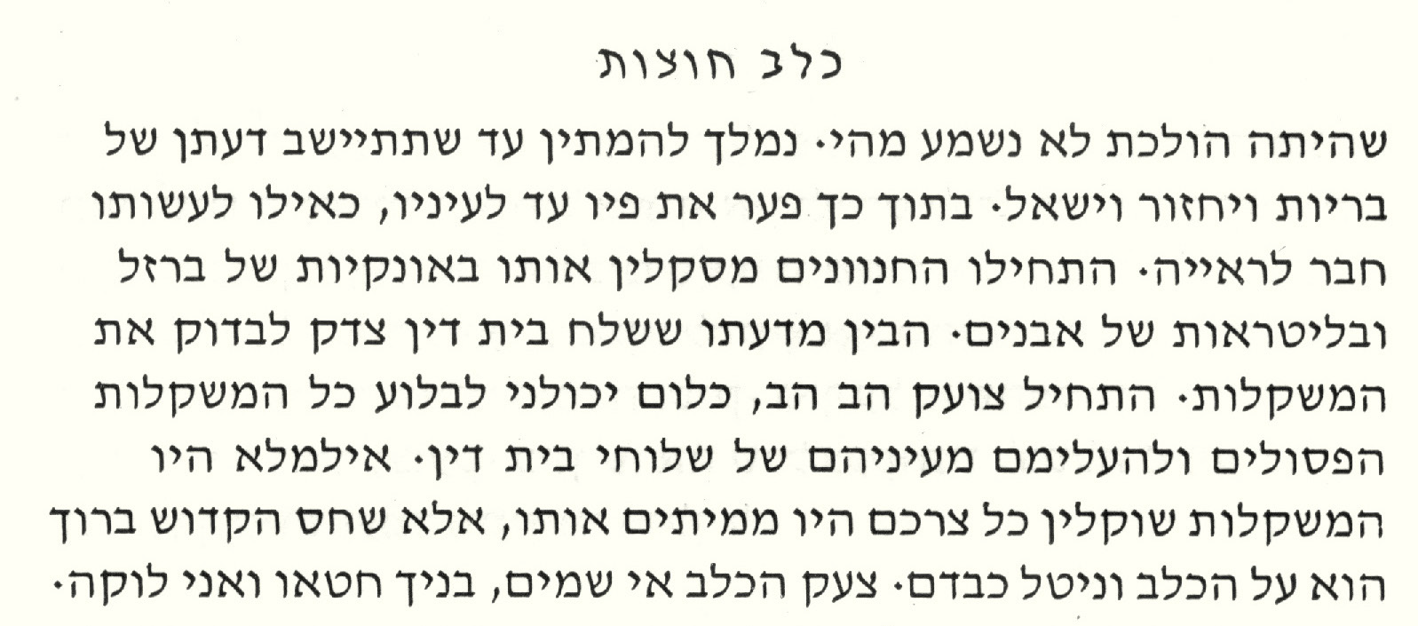
David, the type, marked a radical break from any Hebrew font that had ever been made before. It is highly calligraphic, light in weight, with finely nuanced strokes. Israeli designers took to it slowly, but one event gave it a hechsher that propelled it into extraordinary popularity: its use by Dr. Moshe Spitzer for the 1960 Tarshish edition of S.Y. Agnon’s Kelev Chutzot (“A Stray Dog”), one of the most beautiful books ever made in the State of Israel. Overnight it became the choice for belletristic works and, especially, poetry. By the late 1980s and early 1990s, David would become available in a variety of digital forms, of varying degrees of fidelity to the design. What made it truly universal was its inclusion, for free, with Microsoft’s Windows software, making it a default choice for many uses. Sadly, the italic was not included with these versions; Israelis have preferred, instead (and oddly), to use the automatic “italic” button on various applications to create an artificially inclined letter—to the right, the default setting for the Latin alphabet. The Microsoft version (which is licensed from Monotype) includes all the nikkudot and taamim, though their positioning does not function properly. Moreover, the design of David, which was conceived for Modern Hebrew, has some particularly narrow letters (typical of Modern Hebrew), such as gimel and nun, which make the fitting of biblical diacritics very difficult. The design isn’t well-suited to setting very small type. Where the electronic versions of the David types often fail is in overly tight, poorly balanced spacing, with word spaces that are far larger than they need to be.
David was the type used by the CCAR for its Mishkan T’filah siddur. When I was approached by the CCAR to design the new machzor, Mishkan HaNefesh, one of the first discussions was about the Hebrew type. The CCAR wanted something distinctive, something its own, but a type that would relate somehow to the David type, so that the new machzor would retain a familial similarity with the siddur. Two other facets of the Mishkan T’filah design were to be retained, as well: the navigation bars on the outside margins and the fundamental layout of Hebrew texts and translations in mirror columns. The narrow gimel and nun aside, the David font is too wide for this kind of setting—it needs space to work well A narrower type, one with fewer idiosyncrasies, would be preferable, though it would have to be wide enough to accommodate the full battery of diacritics, as there would be Tanakh segments in the book.
David, as it appears in CCAR’s Mishkan T’filah
The six weights of Shlomo
No such type existed, so I would have to make a new one, as I had done for the Conservative Mahzor Lev Shalem, which I also designed and produced. (It was published in 2010.) Beginning with some of the letter shapes of David, it occurred to me right away that the new type should be called “Shlomo,” the Hebrew name of Solomon, son of King David. As often happens with such inspirations, the new work quickly took a form of its own. The majority of Hebrew letters are square and it is for that reason that its print form (i.e., non-cursive) is called m’ruba (“square”).
How much narrower could it be made and still have space for the diacritics? About 85% is what I determined after a series of experiments, though the nikkud and taamim would have to be on the small side if decent proportions were to kept. That seemed to be a reasonable compromise, as most people who read liturgical and biblical Hebrew use the diacritics as mnemonics. The key to making any typeface easy to read is its internal spacing, and in the case of Shlomo great attention was given to this important aspect of its reader-friendliness. I made Shlomo in several weights and in versions suited to specific sizes. This allows it to be read clearly in the small versions used in the notes at the bottom of the page and in the navigation bars at the right margin of right-hand pages.
The Hillel type by Scott-Martin Kosofsky, as used in Mishkan HaNefesh.
Ashkenazic letterforms.
Shlomo, like David, should be classified as a Sephardic design, the general typology that dominates the majority of Hebrew types, and has dominated it since the earliest Hebrew types were made in the 15th century. The Ashkenazic style, with its greater differentiation of thick and thin strokes (the result of its origin as a letter drawn with a quill pen as opposed to the Sephardic predilection for reed pens) came to the fore only in the 19th century, as exemplified by the types made for the Vilna publishing house of Romm, publishers of the editions of Talmud that are still regarded as the standard. But these were as much a product of the prevailing European fashion for Latin types with exaggerated thick and thin strokes (the so-called “Classical” style, as exemplified by the types of Giambattista Bodoni) as they were a reference to the Ashkenazic letters of old. It was during the late Middle Ages that Ashkenazic letterforms reached their apogee, when they were a Hebrew counterpart to the Gothic Latin letters of Europe. The Hadassah type and its offspring Milon, the type I made for the Rabbinical Assembly, are Ashkenazic designs, even though the lack the thick-thin characteristic. This lessening of contrast while keeping the basic Ashkenazic shapes was the essence of Henri Friedlaender’s contribution.
The Milon type by Scott-Martin Kosofsky, as in Siddur Lev Shalem.
I have a great fondness for Ashkenazic letterforms, so when the CCAR was looking for a contrasting type for special headlines in the machzor, such as the recurrent Sh’ma and the shofar blasts and the section titles, I suggested that we use a type I made some years ago, a classic Ashkenazic letter based on 14th-century manuscripts. I called the type Hillel, in honor of Harvard Hillel, for whom I first made a version of it for use as titles in The Harvard Hillel Sabbath Songbook (1992). For Mishkan HaNefesh, I reworked the design considerably and made for it a full set of diacritics, including the cantillation trope. Not only is Hillel used for these
back cover of the Harvard Hillel Sabbath Songbook, which shows the earlier version of the Hillel type. (Note the odd form of bet.)special purposes within the machzor, it is also used on the cover. I hope to one day have the opportunity to make a text version of these noble letters.
special purposes within the machzor, it is also used on the cover. I hope to one day have the opportunity to make a text version of these noble letters.
Scott-Martin Kosofky designs, produces, edits, composes, writes, and makes types for books in Lexington, Massachusetts, where he is a partner in The Philidor Company. His specialties are complex typographic books, advanced typography for liturgical and biblical Hebrew, and interesting image-based books, with occasional forays into music, art, and graphic design.
There I was, standing next to the Palestinian man when I said “Thank God I’m not like you.” But it felt wrong and degrading. While it was a part of the traditional Aleinu I had been saying for years, I had spent all day with this man and others, along with my fellow HUC students (back in 2004), trying to build bridges of understanding between our two peoples. After a day of discussing and debating, and most importantly, just hanging out, we invited this group of interested but reserved Palestinians to join us in maariv (our evening prayer service). The fact that many of them understood Hebrew gave me a new perspective when going through our prayers, especially when we got to Aleinu.
I’ve always had trouble with the traditional words of Aleinu. And a look at Mishkan T’filah, with the 3 other alternatives, suggests I’m not the only one. It was written in a time when one of the few ways Jews could fight back against persecution and discrimination was liturgically. It helped us to feel better about our lot by thanking God for not making us like them. But times are different now. We are one of the most successful minorities on the planet. And while there are still trouble spots and incidents, the perspective and tone of the traditional Aleinu, even before it was acutely raised in my consciousness during services following our mock “peace talks,” troubled me.
After all, there are a number of examples of Reform liturgists crafting or re-writing prayers to maintain their basic structure and context, but to reshape their phrasing. For example, in nissim b’chol yom, we no longer say “Thank you for not making me a slave” but “Thank you for making me free.” We no longer say “Thank you for not making me a woman” but “Thank you for making me a man/woman.” They are positive reframing of negative statements. Certainly the Aleinu could take this same approach: thank God for who we are as Jews, rather than for not being like everyone else.
The trouble with the existing alternative Aleinus was they were fairly awkward to say. We instinctively wanted to use the traditional chanted melody (i.e. Sulzer), but the words didn’t quite fit. Plus, there were times when the community was saying the traditional version, and I wanted to say an alternative, and the auditory dissonance was too much for me. So, I set about writing a new alternative, which both fit to the traditional melody and proclaimed my thanks for our unique role in the world.
As I see it, two of the most important roles Jews play are: (1) as stewards and guardians of the Earth, as seen in the Garden of Eden and the midrash which has God giving Adam a tour of the whole world and ends with “take care of the Earth, for if it is destroyed, there is no one after you to repair it.” And (2) as messengers of the teachings and morals of Torah to the world. Additionally, while we are a unique people, the reality is that our destiny is intertwined with the other peoples of the world. For example, global climate change doesn’t just effect some people; it effects all of us. We live scattered around the world, our lives intertwined with others.
And so, when the editors of the new machzor, Mishkan HaNefesh, wanted to include my alternative Aleinu, paired with a new translation by Rabbi Shelly Marder, I was both honored and humbled. Symbolically it is very powerful, since Aleinu as a prayer began in High Holy Day liturgy, and from there made its way into the daily service. To have my Aleinu be a part of something so powerful and reflective of the current state of Jewish life, is such a blessing. In this new machzor there is truly something for everyone, and I pray that my alternative Aleinu can be that something for many Jews, for years to come.
Rabbi Dan Medwin is the Publishing Technology Manager at CCAR.
At one point in the Harry Potter series, Dumbledore lets Harry know that there will come a time when he has to choose between what is right and what looks easy. The point he is making is that Voldemort chose the easy over the right; of course Harry should do the opposite. The right choice is clearly the moral one.
When it comes to the creation of Mishkan HaNefesh, the editors were instructed by Rabbi Larry Hoffman to consider a different choice, but one that will have its detractors on either side. In short, when it comes to relevant liturgy we have to choose between doing it right or doing it well. As explained in his piece in the summer 2013 CCAR Journal, rightness is about following the rules. Doing it well is responding to the experience of the worshiper. Of course, the alterations from the rules need not be radical. We don’t need to declare Et laasot l’adonai and for the sake of God overturn everything, but we must practice common sense.
I thought of this as I remembered looking at the traditional Yom Kippur liturgy and omitting countless repetitions of the Thirteen Midot. Now, I think the Thirteen Midot are about as fundamental a text to the Days of Awe as anything. I am just okay not having it repeat more than five or six times in a given day.
What are some more subtle examples of how the editors omitted sometimes important prayers in order to privilege more important pieces? Understanding that there is a limit to how much any given volume can contain, as well as our commitment to an integrated theology along with two-page spreads, the choices were not easy but they were necessary. So for instance, the Torah services in Mishkan HaNefesh omit some verses such as Ki Mitzion. We have nothing against this declaration. We just needed to cut somewhere. The same was true of Gates of Repentance. They cut out Genesis 21. We were not prepared to lose that again.
We also don’t have the full traditional verses of the Sh’ma everytime. There are many beautiful piyyutim that are not included. The Torah and Haftarah portions feature very limited commentary. We would like to offer more in a supplemental book.
Not including things is not easy. We take comfort in knowing that many congregations will avail themselves of screen technology, if not today then in the future, and omissions can be corrected on the screens, or with the old standby, handouts. It is not ideal but then we could only produce a sacred tool to help present effective and meaningful worship. There will never be a “just add water” prayer book.
An old sermon title has a great name: “Steering or Drifting, Which?” The editors of Mishkan HaNefesh wrestled with a different but potent dilemma, “Doing it Right or Doing it Well, Which?” It is an art, not a science, and we are humbled by the task.
Edwin Goldberg, D.H.L., is the senior rabbi of Temple Sholom of Chicago and is one of the editors of Mishkan HaNefesh, the new CCAR machzor.
What follows is a hypothetical letter written after this coming Yom Kippur to myself.
Dear Myself from Three Months Ago,
As I munch my Yom Kippur break-the-fast madeleine, I recall the past ten days with joy that so much about praying with the new machzor went well. But I also feel some regret, and a bit of the subjunctive mood sits in. If only I had known three months ago, when preparing for the Days of Awe, what I now have discovered having used it. So I am writing this to you in hopes that, through some wrinkle in the space-time continuum, you get this before it is too late and can prepare properly.
Here are Ten Things, in no particular order, I wish I had known about Mishkan HaNefesh before these High Holy Days:
The Hashkiveinu in the evening services restores Shomreinu to Malkeinu. After all this is the time of year for the sovereign side of God to be highlighted.
The Kaddish restores the High Holy Day ul-eila mikol. It’s the same matter of privileging the transcendent as above.
The Uvchein restores the image of the Sparks of David, not as a literal progenitor of the Messiah but a symbol of messianic hope.
The Kaddish Yatom inclues now kol yoshvei teiveil, in keeping with our historic Reform value of universalism and in recognition of the worth of all humanity.
HaMelech HaYosheiv is now correctly HaMelech Yosheiv, the proper phrasing for the High Holy Days.
Page 207 of Yom Kippur has Leonard Cohen’s Who By Fire as a commentary to Unetaneh Tokef.
Page 243 of Rosh Hashanah adds to the Akedah verses about Abraham’s brother’s great progeny back in the old country. This is another test of Abraham’s faith. He sacrificed everything for one son, whereas Nahor stayed put and was blessed with so many.
There is a great midrash (Pesikta drav Kahana 24:1) on Cain repenting and receiving a reduction in punishment from God.
Page 607 of Yom Kippur features a great transition from Yizkor to N’ilah:
Set me as a seal (chotam) upon your heart, for love is strong as death. Song of Songs 8:6. Love stronger than death leads to the “seal” motif of N’ilah.
The Prayer for Our Country for Canada contains French.
Bonus Insight: The Al Cheyts are different than in GOR. Wish I had known that!
Rabbi Edwin Goldberg is the rabbi of Temple Sholom of Chicago and is one of the editors of Mishkan HaNefesh.