

We are pleased to share a post from guest-blogger Scott-Martin Kosofsky, who was the designer of Mishkan HaNefesh.
Type design in the 20th century has often been a tug-of-war between two graphic impulses: the typographic style, based upon letterforms that grew out of the metal-casting tradition, and the more freewheeling calligraphic style, based in the ways of the pen. In no script is this more evident than in Hebrew, especially during the years following the founding of the State of Israel.

The two greatest exemplars of this dichotomy, Henri Friedlaender (1904–1996) and Ismar David (1910–1996), each contributed landmark designs for types, each modern but in different ways, that have been part of our daily Hebraic lives ever since their creation. These are the types “Hadassah” (1959, .named for the Hadassah-Brandeis School of Printing, in Jerusalem, where Friedlaender taught) and the eponymous “David” (1954). Both men were Europeans, David born in Breslau and Friedlaender in Lyon, both were trained calligraphers, and both worked as book designers. Friedlaender’s work experience was, however, more in the direction of typefounding than was David’s, working for a time for the Haag-Drugulin foundry (whose offerings included some very popular Hebrew designs of the 19th century), in Leipzig, and at the Klingspor foundry, in Offenbach, where he came under the influence of the renowned craftsman type designer Rudolf Koch, whose Jewish disciples included the renowned designer Berthold Wolpe.
The David type appeared first in a 12 pt. metal version for the Intertype Corporation, American makers of a linecasting machine that was the rival of Linotype. Several years later it became available on the Photon, the earliest commercially viable phototypesetting system. The design did not include diacritics (the vowels and trope), but it did have a very special feature: a left-slanting “italic” of a singularly gracious design. The idea of a companion italic had ever existed before in Hebrew, though many medieval Ashkenazic scripts were left-leaning. (David also drew a monoline “sans serif” version, though it was not issued commercially in his lifeteime.) For a version of the David types released by Stempel in 1984, for one of its early digital typesetting machines, Ismar David created a limited set of diacritics.

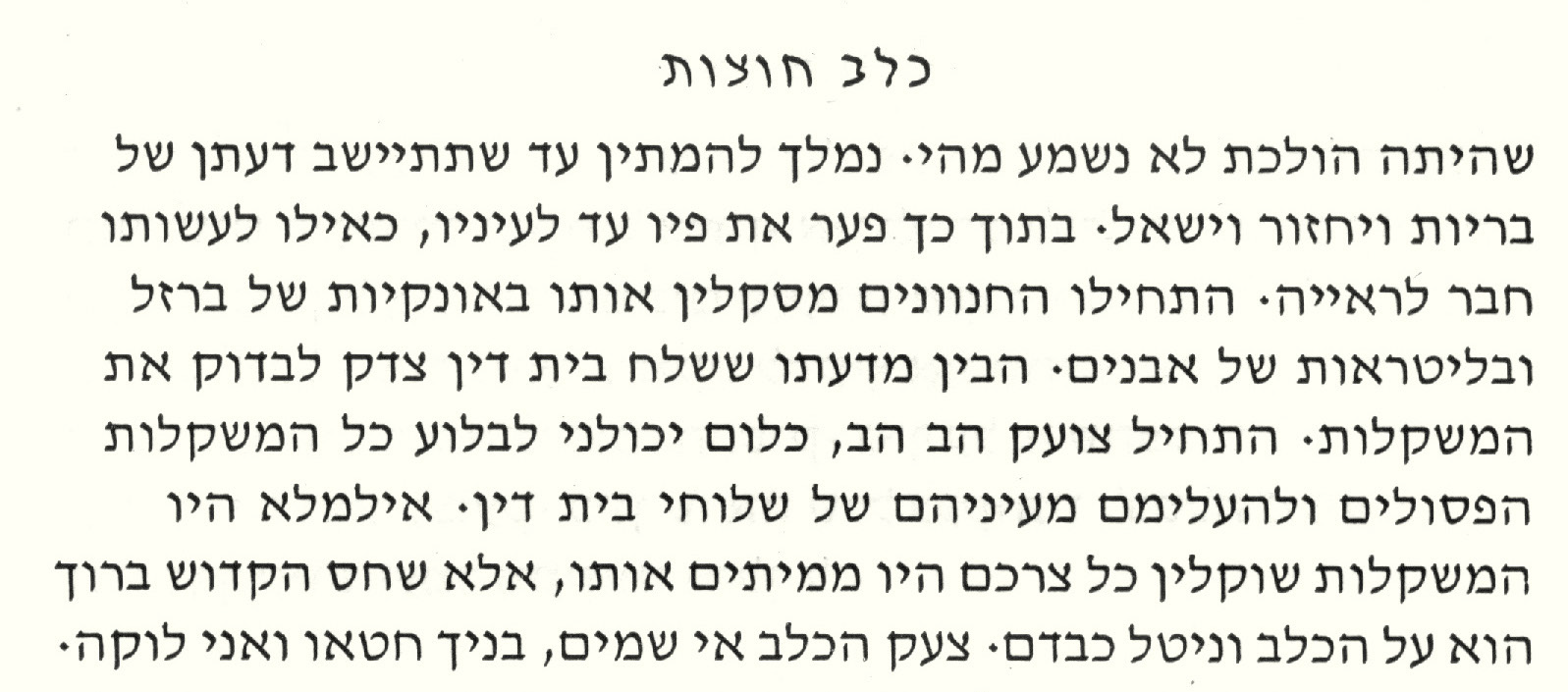
David, the type, marked a radical break from any Hebrew font that had ever been made before. It is highly calligraphic, light in weight, with finely nuanced strokes. Israeli designers took to it slowly, but one event gave it a hechsher that propelled it into extraordinary popularity: its use by Dr. Moshe Spitzer for the 1960 Tarshish edition of S.Y. Agnon’s Kelev Chutzot (“A Stray Dog”), one of the most beautiful books ever made in the State of Israel. Overnight it became the choice for belletristic works and, especially, poetry. By the late 1980s and early 1990s, David would become available in a variety of digital forms, of varying degrees of fidelity to the design. What made it truly universal was its inclusion, for free, with Microsoft’s Windows software, making it a default choice for many uses. Sadly, the italic was not included with these versions; Israelis have preferred, instead (and oddly), to use the automatic “italic” button on various applications to create an artificially inclined letter—to the right, the default setting for the Latin alphabet. The Microsoft version (which is licensed from Monotype) includes all the nikkudot and taamim, though their positioning does not function properly. Moreover, the design of David, which was conceived for Modern Hebrew, has some particularly narrow letters (typical of Modern Hebrew), such as gimel and nun, which make the fitting of biblical diacritics very difficult. The design isn’t well-suited to setting very small type. Where the electronic versions of the David types often fail is in overly tight, poorly balanced spacing, with word spaces that are far larger than they need to be.
David was the type used by the CCAR for its Mishkan T’filah siddur. When I was approached by the CCAR to design the new machzor, Mishkan HaNefesh, one of the first discussions was about the Hebrew type. The CCAR wanted something distinctive, something its own, but a type that would relate somehow to the David type, so that the new machzor would retain a familial similarity with the siddur. Two other facets of the Mishkan T’filah design were to be retained, as well: the navigation bars on the outside margins and the fundamental layout of Hebrew texts and translations in mirror columns. The narrow gimel and nun aside, the David font is too wide for this kind of setting—it needs space to work well A narrower type, one with fewer idiosyncrasies, would be preferable, though it would have to be wide enough to accommodate the full battery of diacritics, as there would be Tanakh segments in the book.


No such type existed, so I would have to make a new one, as I had done for the Conservative Mahzor Lev Shalem, which I also designed and produced. (It was published in 2010.) Beginning with some of the letter shapes of David, it occurred to me right away that the new type should be called “Shlomo,” the Hebrew name of Solomon, son of King David. As often happens with such inspirations, the new work quickly took a form of its own. The majority of Hebrew letters are square and it is for that reason that its print form (i.e., non-cursive) is called m’ruba (“square”).
How much narrower could it be made and still have space for the diacritics? About 85% is what I determined after a series of experiments, though the nikkud and taamim would have to be on the small side if decent proportions were to kept. That seemed to be a reasonable compromise, as most people who read liturgical and biblical Hebrew use the diacritics as mnemonics. The key to making any typeface easy to read is its internal spacing, and in the case of Shlomo great attention was given to this important aspect of its reader-friendliness. I made Shlomo in several weights and in versions suited to specific sizes. This allows it to be read clearly in the small versions used in the notes at the bottom of the page and in the navigation bars at the right margin of right-hand pages.


Shlomo, like David, should be classified as a Sephardic design, the general typology that dominates the majority of Hebrew types, and has dominated it since the earliest Hebrew types were made in the 15th century. The Ashkenazic style, with its greater differentiation of thick and thin strokes (the result of its origin as a letter drawn with a quill pen as opposed to the Sephardic predilection for reed pens) came to the fore only in the 19th century, as exemplified by the types made for the Vilna publishing house of Romm, publishers of the editions of Talmud that are still regarded as the standard. But these were as much a product of the prevailing European fashion for Latin types with exaggerated thick and thin strokes (the so-called “Classical” style, as exemplified by the types of Giambattista Bodoni) as they were a reference to the Ashkenazic letters of old. It was during the late Middle Ages that Ashkenazic letterforms reached their apogee, when they were a Hebrew counterpart to the Gothic Latin letters of Europe. The Hadassah type and its offspring Milon, the type I made for the Rabbinical Assembly, are Ashkenazic designs, even though the lack the thick-thin characteristic. This lessening of contrast while keeping the basic Ashkenazic shapes was the essence of Henri Friedlaender’s contribution.

I have a great fondness for Ashkenazic letterforms, so when the CCAR was looking for a contrasting type for special headlines in the machzor, such as the recurrent Sh’ma and the shofar blasts and the section titles, I suggested that we use a type I made some years ago, a classic Ashkenazic letter based on 14th-century manuscripts. I called the type Hillel, in honor of Harvard Hillel, for whom I first made a version of it for use as titles in The Harvard Hillel Sabbath Songbook (1992). For Mishkan HaNefesh, I reworked the design considerably and made for it a full set of diacritics, including the cantillation trope. Not only is Hillel used for these

special purposes within the machzor, it is also used on the cover. I hope to one day have the opportunity to make a text version of these noble letters.
Scott-Martin Kosofky designs, produces, edits, composes, writes, and makes types for books in Lexington, Massachusetts, where he is a partner in The Philidor Company. His specialties are complex typographic books, advanced typography for liturgical and biblical Hebrew, and interesting image-based books, with occasional forays into music, art, and graphic design.